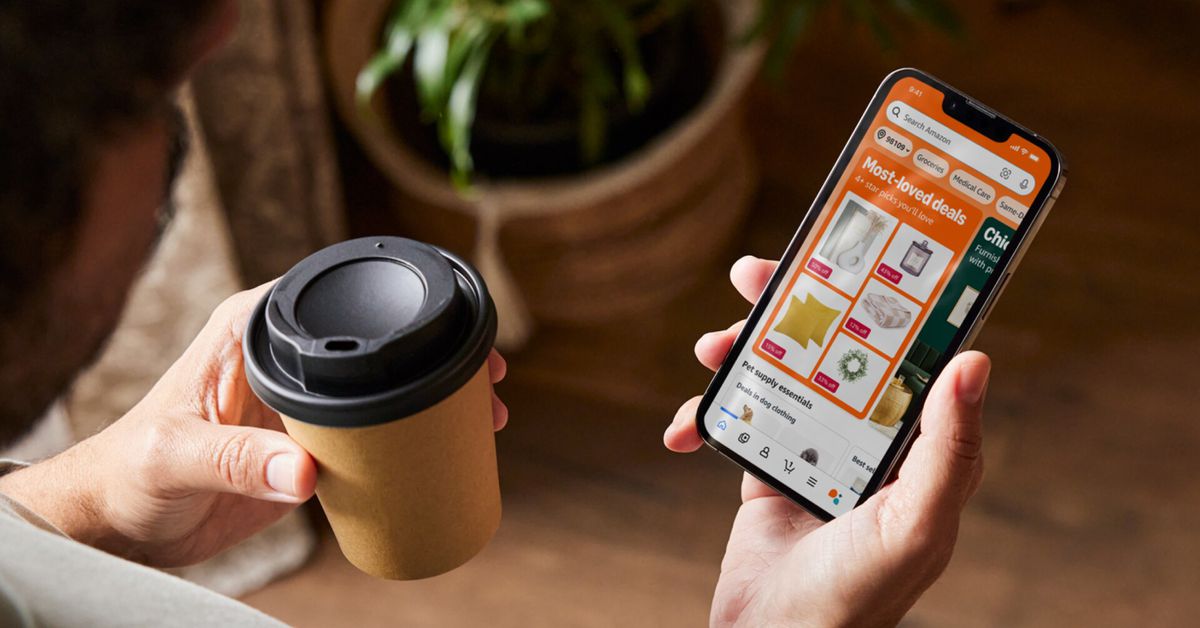
Fundamentally, the redesign seems to serve the same purpose as the current layout by surfacing personalized recommendations based on your purchase habits, browsing history, deals, and other signals based on your shopping activity. Today’s change just builds on that formula with bigger, brighter graphics, more dynamic product curations and groupings, and an increased emphasis on horizontal scrolling for the various collections and sub-hubs you’ll find. (It also makes more room for bigger, thinly veiled ads.)
Sports fans may see a Thursday Night Football ad alongside a refill of their favorite pre-workout, for example, while parents may see toys, children’s books, and perhaps the new colorific Kindle while being tempted by a sale on diapers.
Amazon says it’s been iteratively testing different pieces of these UI changes for a while. The company calls out a new Buy Again hub that makes it easy to stock up on your frequently purchased goods, for example, and I’ve seen that change (but not the others) for some time now.
Again, these recommendations were previously available and worked similarly in various forms before, but I personally think the current experience feels too random and scattered to be useful.
Amazon is hopeful the coming changes will improve on that and ultimately put more products in front of you that are relevant to your taste and needs — and perhaps tempt a little more money out of your wallet along the way.

